
Hi folks, and welcome to another edition of Box Art Brawl!
Last time, we took a look at the fourth entry in Capcom’s Mega Man franchise: Mega Man 4 for the NES. It wasn’t a close one, either; far from it! A whopping 79% of you preferred the Japanese variant, with the EU version bringing in 15% of the vote, and the North American version trailing significantly at 7%.
This week, we’re going to be looking at a classic FPS for the GameCube: Timesplitters 2. It’s hard to believe that this game is now 20 years old, because in many ways, it still feels as fresh as it did back in 2002. Featuring a story mode and the classic arcade mode, it gained legions of fans and remains one of the most fun experiences you can have with an FPS title to this very day.
Obviously, this brawl will be a duel between North America and Europe, since Timesplitters 2 was never released in Japan. Enough talking though, let’s get cracking!
Be sure to cast your votes in the poll below; but first, let’s check out the box art designs themselves.
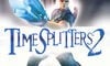
North America

North America’s box art for Timesplitters 2 features a single character front and centre, pointing a pretty huge gun towards the viewer. There’s a whole bunch of strobe effects coming from the centre and moving outwards, but otherwise, there’s not a whole lot of colour going on here. The logo itself is nice and bold in the centre of the image.
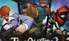
Europe

Europe’s variant is quite different, featuring three separate characters in a composition that resembles comic book art, with panels separating each of the characters. Not only that, but the artwork itself is more stylised; it’s busier and there’s more going on, but it makes for a pleasing image overall. The logo is a bit smaller here and sits lower than the NA variant, but we wouldn’t want it to cover that stunning artwork.
Thanks for voting! We’ll see you next time for another round of the Box Art Brawl.